Analyze employee activity
You can use the Member dashboard page to gain insights about an individual employee’s activity and analyze how they spend their time at work. If a member uses multiple devices, this page consolidates data from all devices into a single view.
Navigation references:
- Via Dashboard: Click an employee’s name in the Top Productive/Unproductive Members tile
- Via Activity: Click the specific Member or Device name in the activity table
- Via Timeline: Click the specific Member or Device name in the timeline table
- Via Screenshots: Click the device name in the screenshot card
The member dashboard is divided into two tabs: Timeline, which displays the time metrics and 24-hour visual timeline; and Analytics, which displays activity summary, screenshots, and apps/websites visited by the employee.
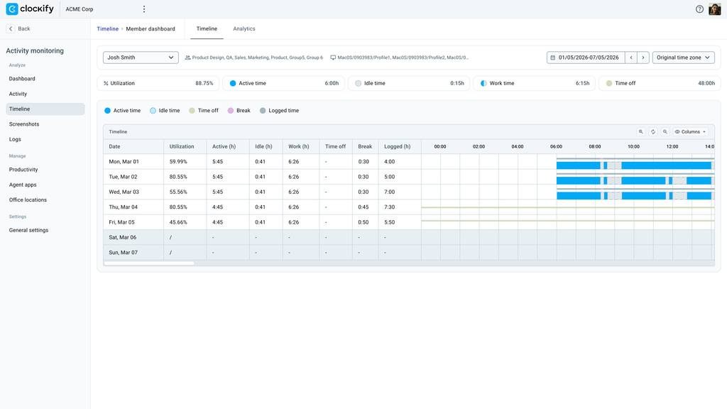
The top of the page displays the employee’s name, the group (or groups) that the employee belongs to, and the name of the assigned device agent.
When viewing the dashboard, you can select a pre-defined date range or specific date on the time picker to change the displayed information. This gives you the flexibility to view employee activity from a short or extended period of time.
Review summary cards #
A set of cards displayed at the top of the dashboard gives you a snapshot of an employee’s total time recorded for the selected day or date range.
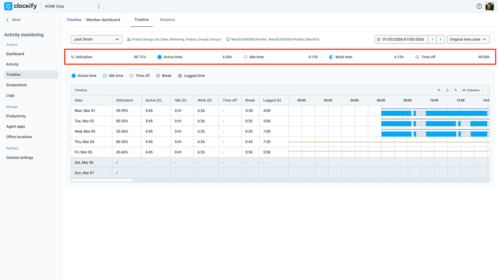
You can use the summary cards for the following:
- Evaluate capacity and productivity: Check Utilization to determine how effectively active time was spent on productive applications and websites relative to the member’s expected daily work capacity.
- Identify unexplained inactivity: Compare Idle time against total Work time to spot unusually long stretches of inactive time during a working day.
- Account for scheduled absences: Review Time off to verify whether lower active hours or adjusted capacity calculations are due to approved leave, public holidays, or PTO.
For definitions of the metrics, check out Activity monitoring basics.
Analyze timeline and activity #
By looking at the timeline and screenshots captured by the system, you can easily verify how an employee spends their day for the selected time period.
Active time visualization #
Each row of the 24-hour horizontal strip displays a visual chart of how the employee spent their day. The time blocks are obtained from Clockify time entries for the selected period and represent the following activities: Active time, Idle time, Time off, Break, and Logged time.
Each activity is colored differently to make it easier to distinguish on the timeline. For example: if you see a time block with diagonal stripes, it means that the employee was idle during that period.
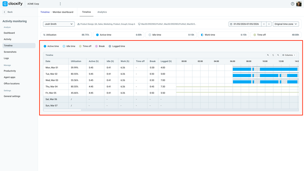
If you are a multi-regional organization, you can change the timezone display to Original timezone to adjust the timeline view according to the user’s timezone.
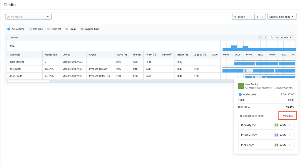
You can view more information about the time block by doing the following:
- Hover over the time block to display an info bubble with activity details
- Click the View Logs option inside the tooltip to open the detailed activity record for that period in the Logs page
In the Analytics tab, the Activity chart displays a breakdown between active and idle time. You can cross-reference detected idle time periods with logged breaks to ensure that rest periods are properly recorded.
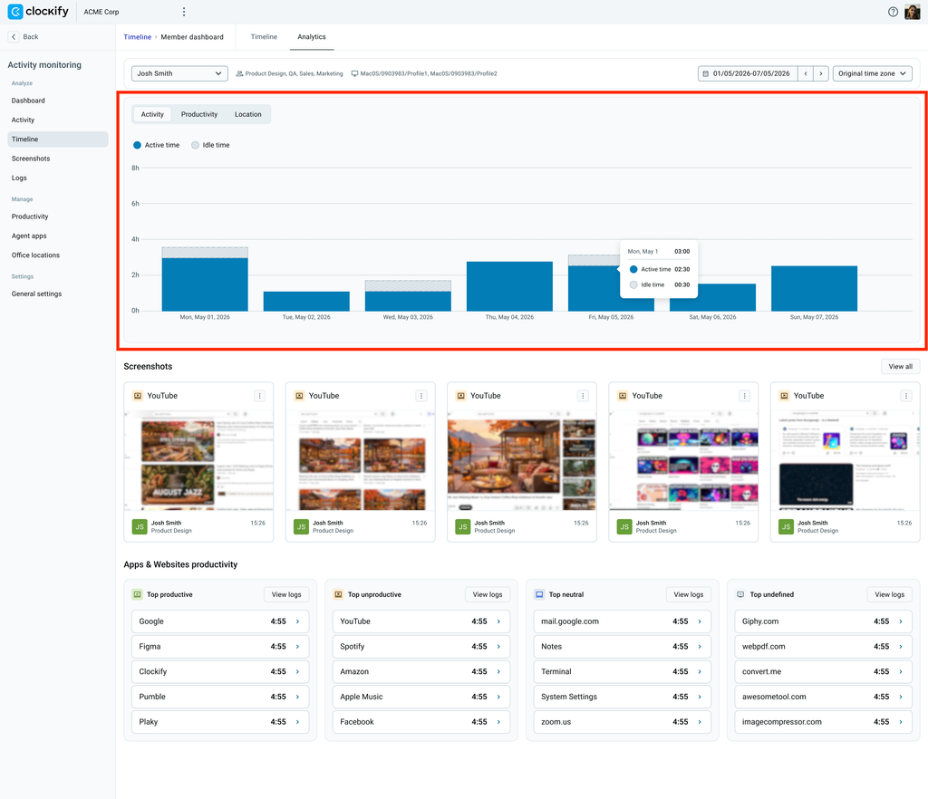
Active time does not automatically mean productive time. You can verify the usage trend when you view the Productivity chart discussed in the next section.
Daily utilization and location trend #
With the Productivity chart, you can see how much active time is spent by the employee per day within the specified time period. The chart displays the following categories: Productive, Unproductive, Neutral, and Undefined.
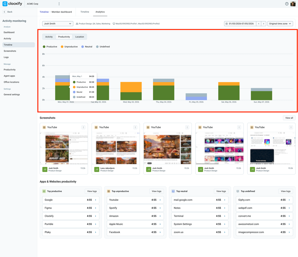
Looking at the utilization trend in the chart can help you gain insight on working patterns. If an employee has undefined hours logged, you can look at the Apps & websites productivity section to see which applications and websites need to be categorized.
Check Activity monitoring basics to know how utilization scores are calculated.
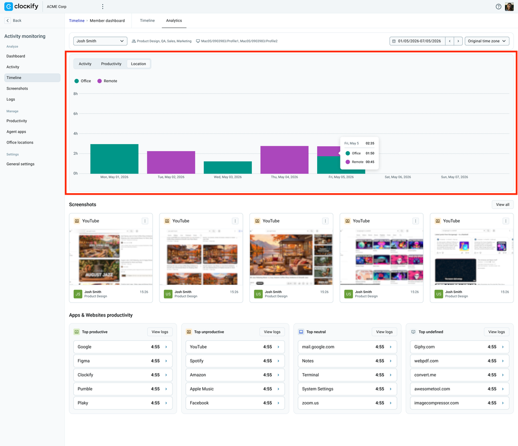
The Location chart displays where the employee spends most of their time while working without having them to report their location manually. Depending on the locations set up in your workspace settings, it displays the following locations: Office and Remote.
Screenshots and app usage #
The Screenshots gallery displays the most recent screenshots captured during the tracking session. To access the full gallery, click View all. You can use the screenshots to verify the applications and sites recorded in the Apps and Web productivity section.
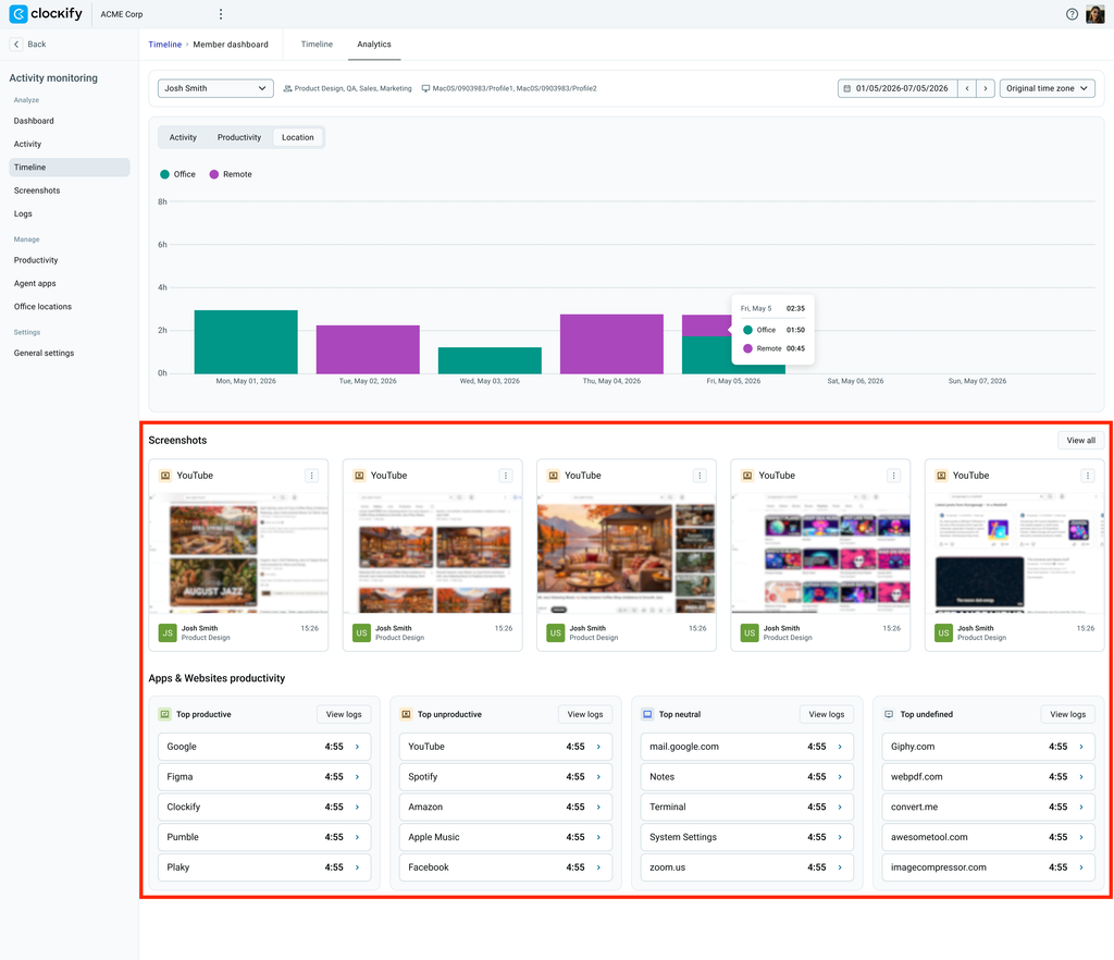
In the Apps & Websites productivity section, you can review the top 5 applications used by the employee across four categories: Productive, Unproductive, Neutral, and Undefined. Click View logs in any category to view full details.
If an app or website constantly appears in the top list of the Undefined tile, review and assign an appropriate productivity category to ensure that usage data is accurately recorded. For detailed instructions on categorizing applications and websites, see Classify apps and websites.
FAQs #
How do I accurately view activity timeline data for employees in different timezones?
Select Original timezone from the timezone dropdown menu to automatically adjust the visual timeline according to the employee’s local timezone.
Why does my employee’s activity show a lot of undefined hours?
If you see undefined hours logged in the chart, it means that there are apps and websites that still need to be categorized. You can review these items at the Apps & websites productivity section located at the bottom of the page.