Summary report
You can see where your company spends time using Summary report. It takes all the time entries in your account and groups them by project, client, user, groups, tag, or date.
Like in any other time report, you can use filter data, change time range, share report, create invoice from time reports and print/export the results.
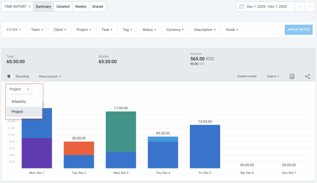
Bar chart #
The bar chart shows you the summary of all time entries for each day in the selected date range. It also shows how much of it is billable (dark green) vs non-billable (light green), or the time that was spent working on a specific project.
Switch between Billability or Project with a dropdown on the right and hover over the chart to see the exact numbers.
Breakdown table #
The pie chart shows you the summary of all time entries grouped by a certain criteria (project, client, user, group, tag, and date).
You can further breakdown data by sub groups.
For example, you can:
- Group by client -> user to see who worked for what client
- Group by group -> user -> date to see who worked when
You can click on the number next to the group to expand it and see a more detailed breakdown for that group.
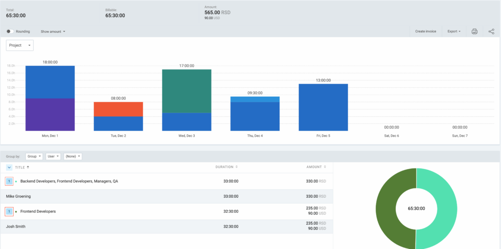
To export data without billable amounts, click Show amount and choose Hide amount.
Detailed information #
By clicking on the item from the Summary report (e.g. user name, client, project etc.) the Detailed report will be opened with the appropriate filter applied. The Detailed report can be opened in the same window or in a separate tab for an easier overview and comparison.
More on reports #
To compare scheduled and tracked tasks and assignments, refer to the Assignments report.
For a detailed weekly overview of your tracked time and expenses, refer to our Weekly report article.
To manage and export all entry details, explore the Detailed report article.